Posts » I’m feeling wary

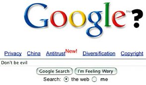
The September 1st edition of the Economist magazine has a wonderful cover. It is a version of the Google front page that at first glance looks perfectly normal, but on closer inspection has some not-so-subtle modifications. My favorite part is the "I'm feeling wary" button.
No offense meant, dear Google.